To comply with my non-disclosure agreement, I have omitted and obfuscated confidential information in this case study. The information in this case study is my own and does not necessarily reflect the views of POP.
Methods used for the redesign:
Card sorting:
Card sorting is a well-known method for IA design that allows participants to group and put settings in an order that makes sense to them. Through this process, we can have a peek of a user’s mindset. It also helps us to see which category names are used, and not used.
User testing:
With the qualitative user tests, we could see how participants would navigate our mid-fidelity prototype for accomplishing tasks and how many potential traps were in the proposed structures.
Participants’ reactions are very valuable to us. Sometimes participants thought they successfully completed the task, but in fact, they failed. That helped us understand the real problems of the proposal.
Card sorting session
We decided to take a hybrid approach, since there wasn’t a lot of already defined naming or groupings. In it groups of 5 people were split into teams and each session took about 40m. To give them a bit more context, there was a small user story for each topic.
Some of the guidelines for the participants:
- Organise the topics (cards) as a team into each category (pink sticky notes).
- Look at one topic at a time.
- Come to an agreement as a group, as to where the topic belongs to.
- Do NOT create or change topics.
- Can replace or create new categories (blue sticky notes).
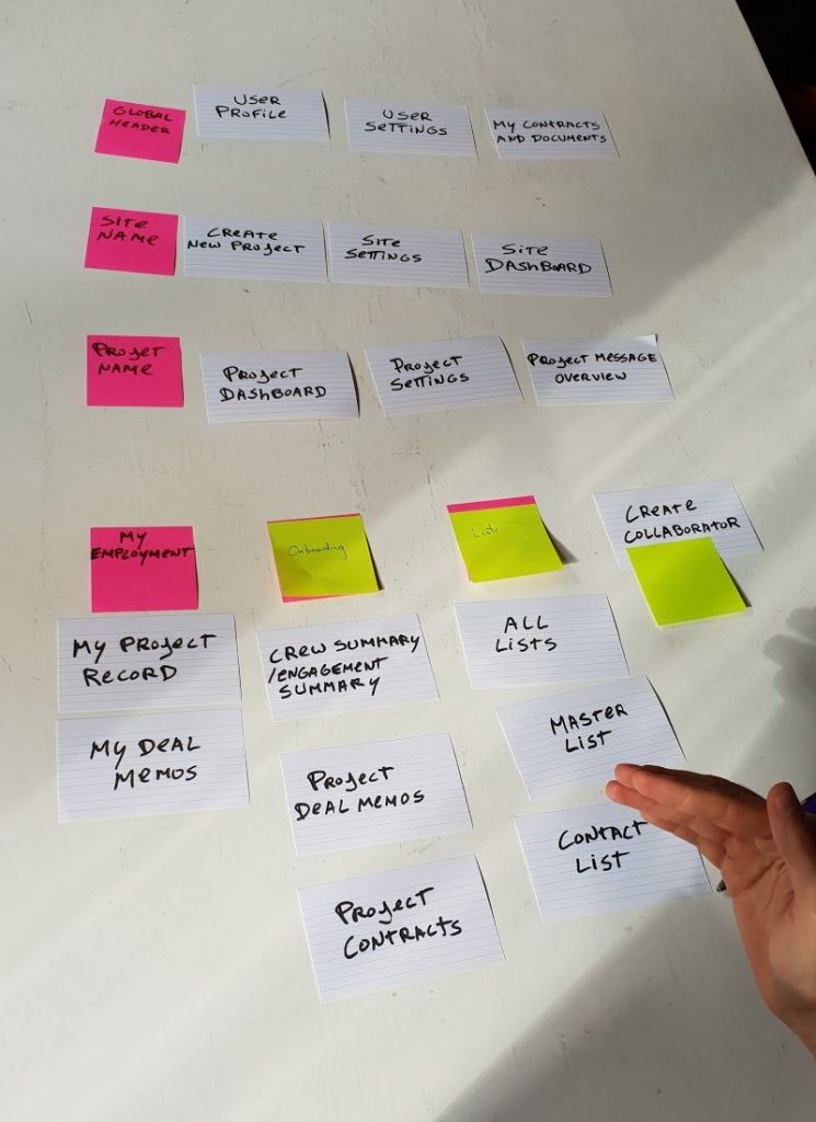
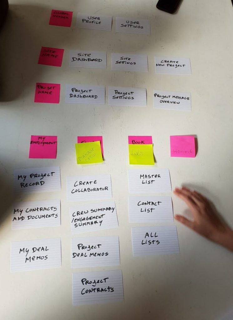
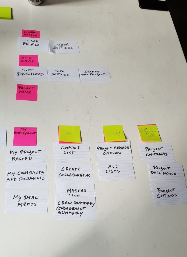
Insights
Is it from the production’s or mine?
The user actions and admin actions clearly weren’t connected to each other. Differentiating between them was important to our users. During the sessions users found more intuitive to separate one from the other.
Go with the flow
People were look to the experience as a whole, once they started looking at the topics they started to group them not only by the categories that they seemed to belong, but also following the production workflow. Eg. I have a site, so from here I need to create a project and after I want to add some people inside that project.
Label it again
We should always be careful with using technical terminology. Some of the topic and category labels weren’t quite clear for the participants, only after giving a user story/context related to the topic would participants start to understand.
Groupings
The most complicated topic groupings happened inside the project. Groups formed inside the project were messages, team and documents.
User testing
After gathering all of the feedback from the card sorting sessions we started to do some mid fidelity prototypes. From those prototypes we wanted to assess which of the 3 prototyped navigations are the most easy to use and easy to access.
Goals
Make it easy to use:
- That people can easily find what they need in the navigation;
- That the navigation is intuitive and the labels are meaningful;
- From the side navigation options, what should be more intuitive:
- To detach your crew member navigation (top navigation) from the admin navigation (side navigation);
- To keep everything in one place (everything goes on the side navigation).
Make it easier to access:
- That all menus are at hand and that it’s easy to change between pages;
That the time spent on the navigation is low.
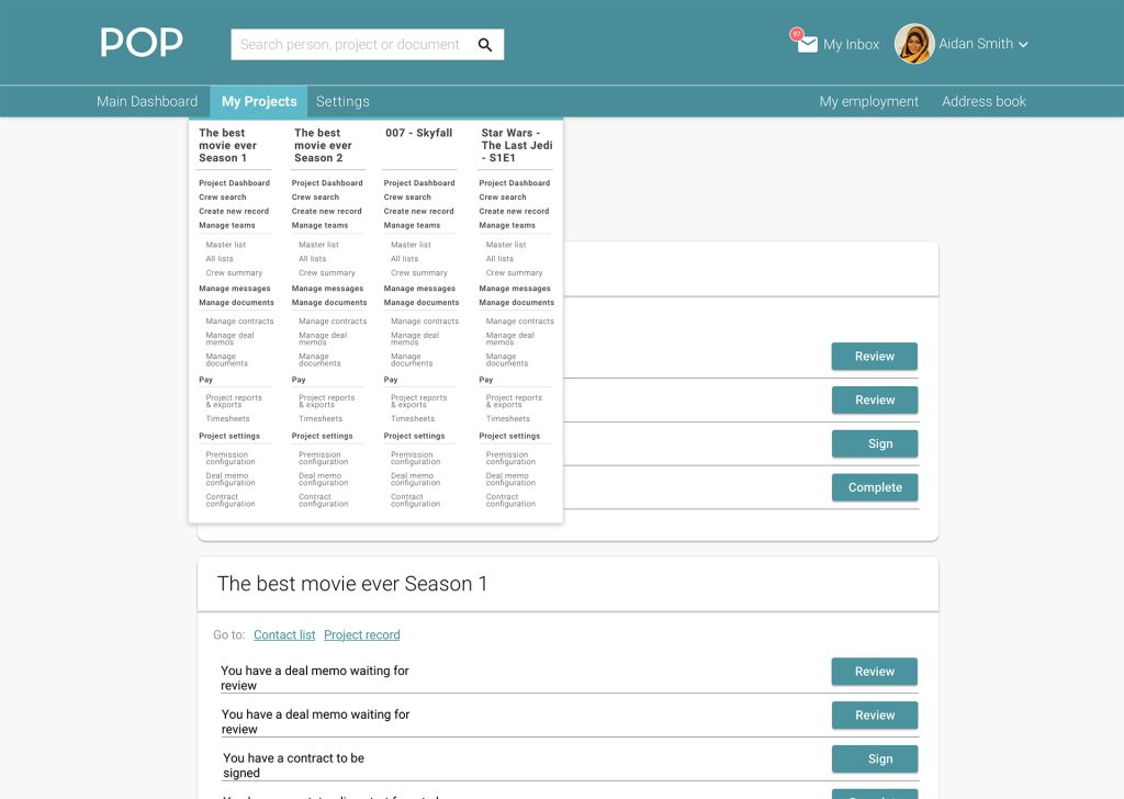
1. Mega menu with all the actions available at once.
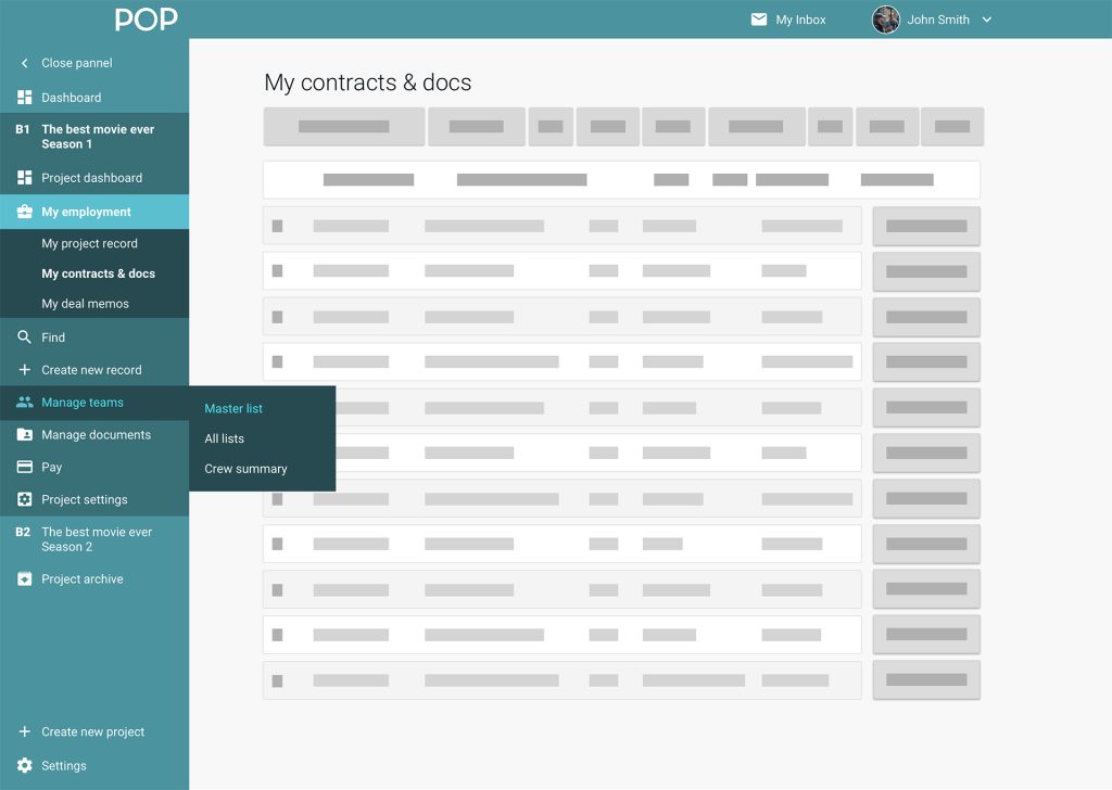
2. Side and top navigation with the admin and user actions sitting on the side.
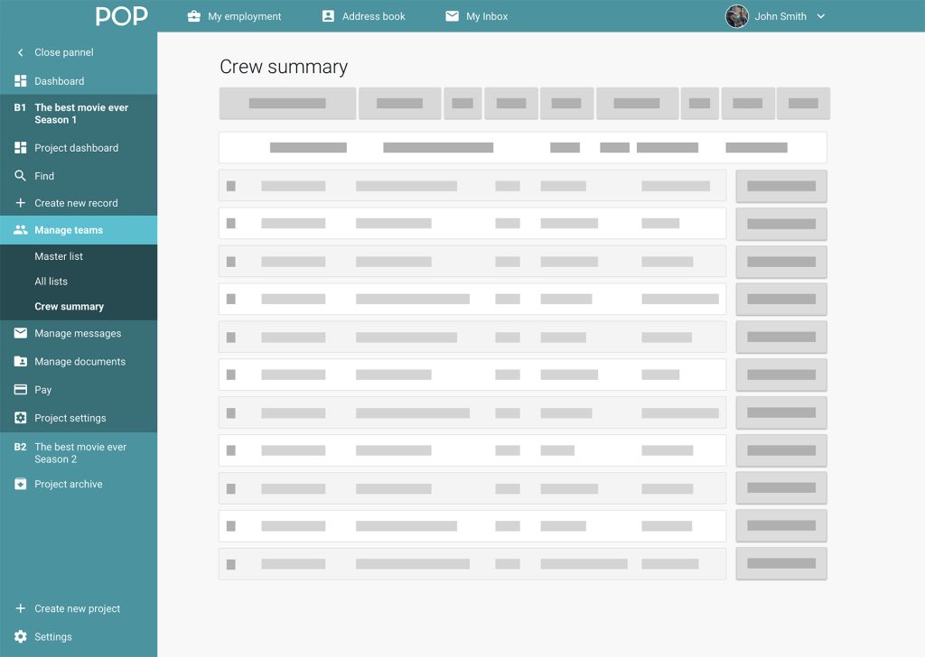
3. Side and top navigation with the admin actions sitting on the side and user actions on top.
Process
- Mocked three prototypes to be presented to users;
- Described several tasks that we’d like them to undertake on the platform;
- Presented the prototypes in a randomised order, so that we wouldn’t get invalid data from user tendencies to perform better on later tasks and prototypes.
- Used qualitative data approach.
Results
There was an increase of response time on the side navigation compared to the mega menu. Users usually took a lot more time to find the information that they were looking for on the mega menu, which they found it was quite overwhelming. They found some of the labels to be confusing because they were actions instead of nouns. They really liked the idea that the menu could be collapsed to utilise the space.
6/6 people found the sidebar to be the easiest to use
5/6 people found that the the separation between my menu and admin menu made the most sense
Feedback:
Participants found the language create record to be quite hard to understand. They didn’t realise that it was to create a new crew member. Most of them clicked intuitively because the plus icon was there to help.
Record
Participants suggested contributor (industry term), user, profile or collaborator rather than record.
Actions and nouns mix didn’t seem to work out well. Eg. Find and Pay as an action implied that something was happening if you were to click on it.
Team
Participants suggested adding team.
Participants didn’t actually knew what crew summary was. It was hard for them to make a decision when trying to find all the crew members between crew summary and master list.
Also changing permissions on the person’s profile seemed to be the most intuitive place for it to happen. Two of the users did go to the project settings.
Messages
Participants suggested messages instead of manage messages.
Half of the participants were looking to send an email from manage messages intuitively. The other half were already aware that you do that from lists. Also manage messages label didn’t felt like the correct term.
Participants were intuitively saying that they would create the camera department group first in the master list, to be able to send a message.
Assumptions vs Reality
The project labels and actions were participants struggled the most. Once we started to separated “Manage” into “Manage” and “Team” it really started to help them find things with ease.
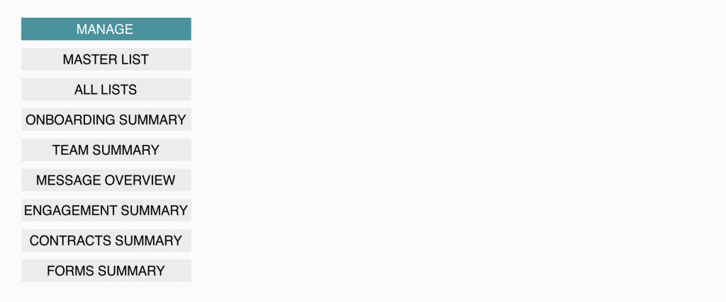
Undoubtedly, “Manage” and “Team” were not connected to each other, the differentiation from team actions to actions performed on documents, contracts and forms had to be emphasised.
Participants also found that “Messages” should be directly under project, “Messages” didn’t made much sense in any of those other groupings and they wanted be able to access it quickly.
Thank you
If you’ve made it this far, thanks for reading. I hope this gave you a peek into my design thinking and how I rationalise my decisions, as well as the way I work. Please leave a like or share to show your appreciation.


Leave a Reply
You must be logged in to post a comment.