To comply with my non-disclosure agreement, I have omitted and obfuscated confidential information in this case study. The information in this case study is my own and does not necessarily reflect the views of POP.
Personas
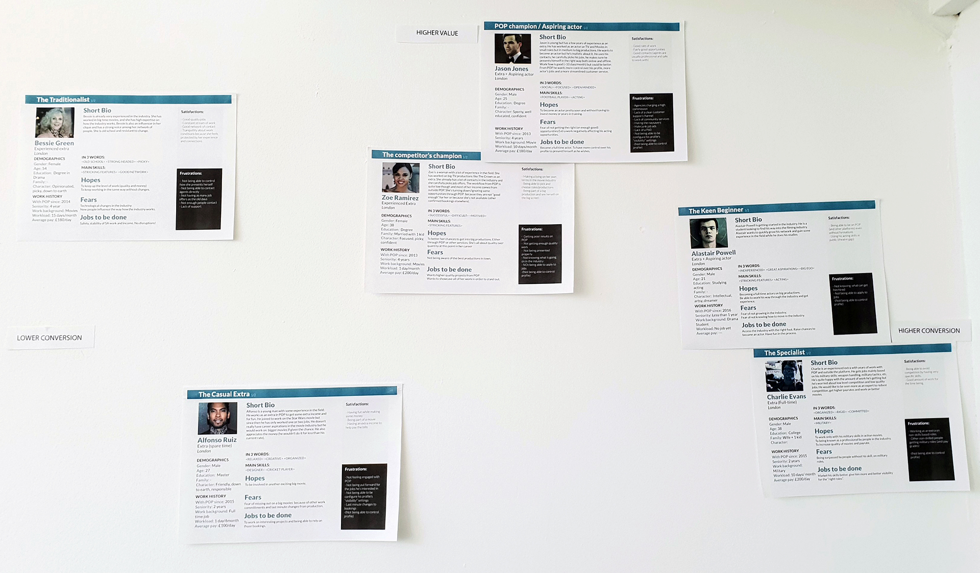
After doing some interview with some background artists, we laid out some personas according to our research.
Our approach to the personas started out by doing some interviews to the people who are in the platform for a long time.
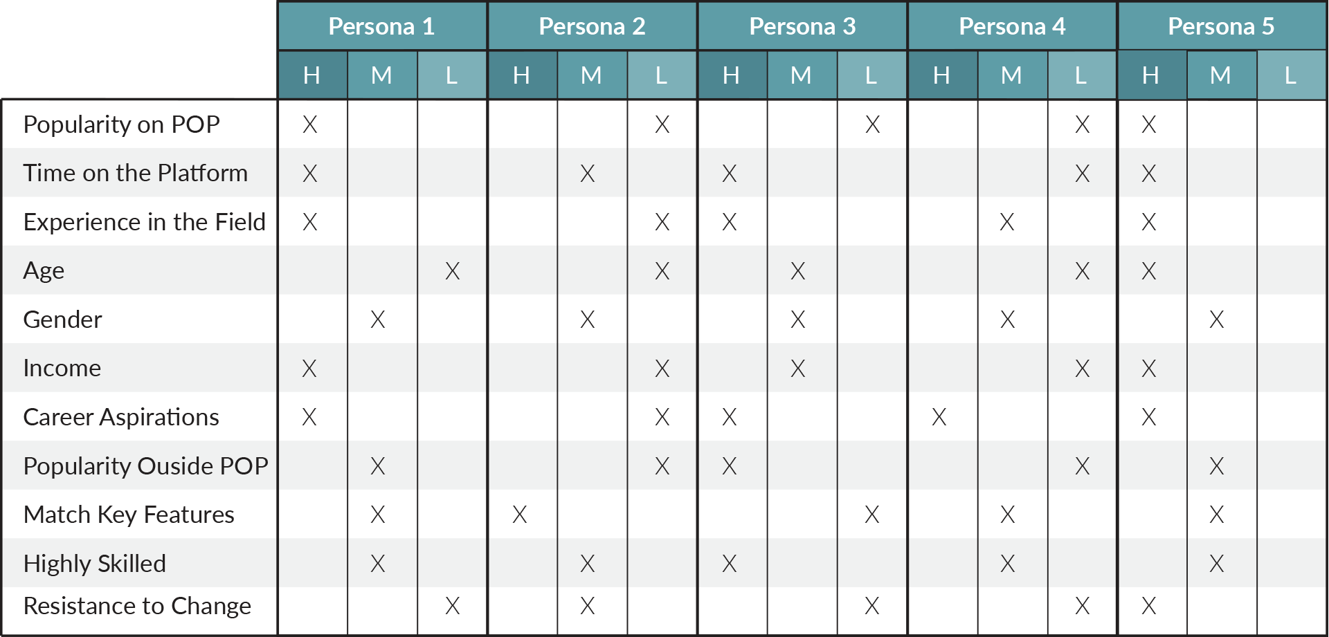
After having a review on the people we interviewed, we decided that we needed to limit the spectrum of the personas that we had found, according to our business needs and features.
So we draw out and traced in a table, all the possible scenarios for the most interesting personas.
Challenges
These were the main challenges set:
- Move away from pop ups inside pop ups;
- Improve the overall UX and the UI;
- Make it a place that everyone in the team can come and view messages;
- Make it mobile friendly.
Message composer
Description
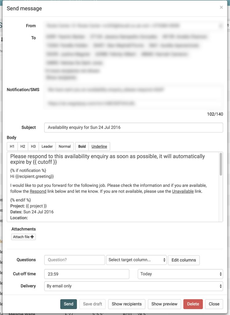
The message composer had bad positioning of buttons that usually induced users to errors with, for the example, the delete on the right not being the primary action that we wanted the user to perform once he starts typing a message. The UI itself didn’t had enough contrast and the message sections were not clear enough for the user.
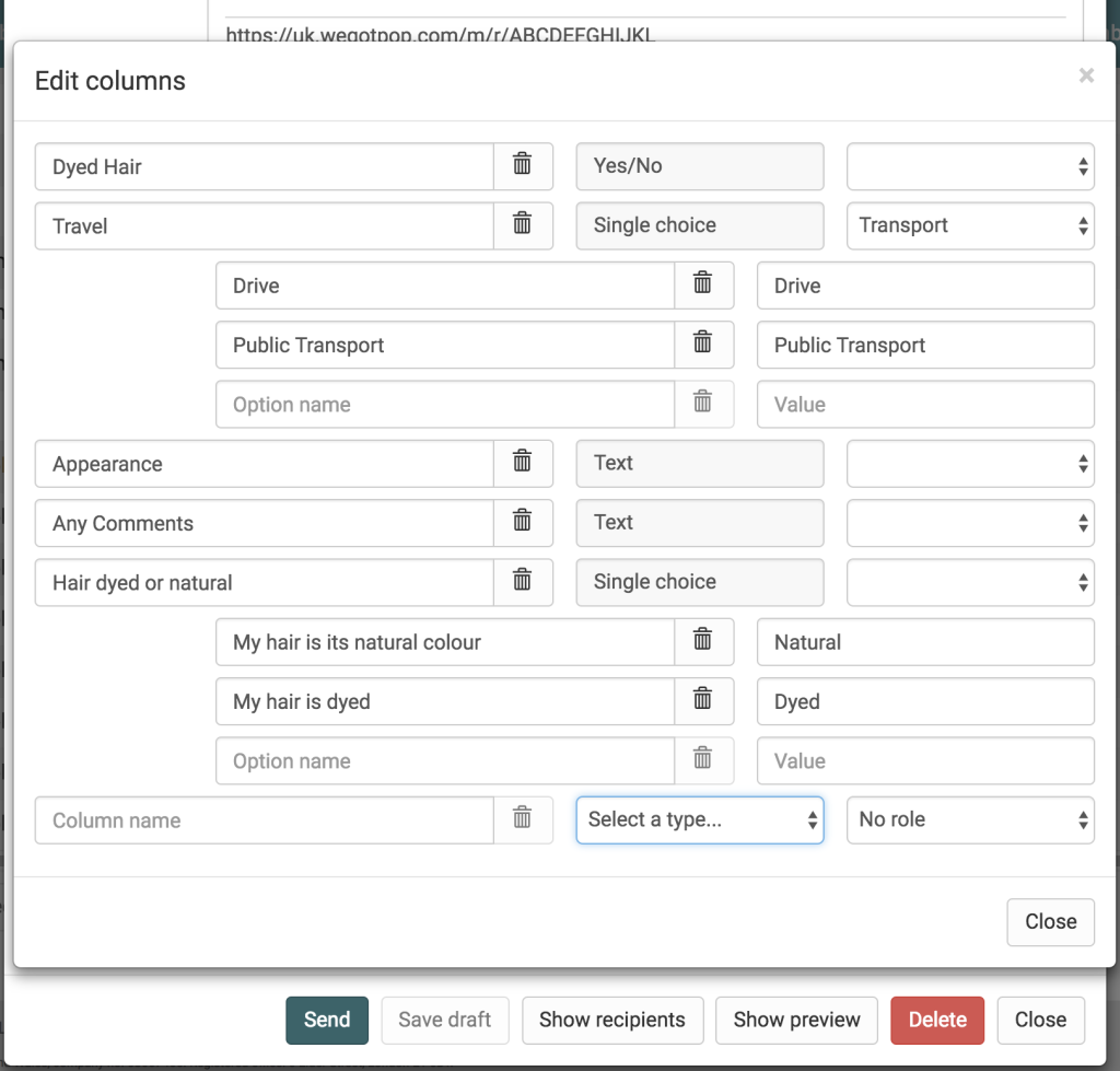
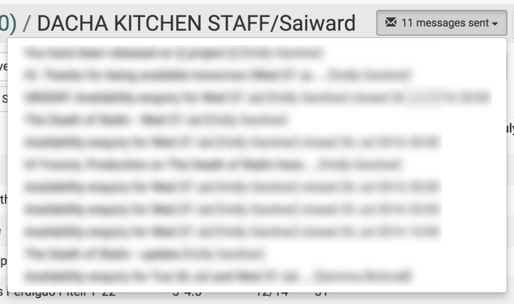
The main issue was the questions section and how confusing it was to create them. To create a question the user had to add the question and click edit column. The edit column would then take the user to another pop up, with he had to fill according to what kind of question structure he wanted. Afterwards the user had to close the message and select the column that he had just created. This was method was counter intuitive and confusing for the user.
All these pop ups and clunky selections, were not mobile friendly as mobile didn’t handle all those pop ups very well.
Objective
As an enterprise user I want a better experience of creating messages – because the current interface creates pop ups, within pop ups, which is a poor experience on mobile. I want this in order that I can compose messages more easily across devices to support my flexible working style.
Technical Scope
The message editor is a modal that takes it’s state from the list context is attached too. The messaging has grown increasingly complex and the agents have started to want to compose messages on their phone we have had a growing number of issues with the styling and z-index of the elements of the message composer.
Desired features
- The use of modal versus page-level editor should be configurable by site
- The new page should have a responsive design that is by default, mobile-friendly
- It should be possible to pop the new message editor into a new tab or navigate directly to it
- It should be possible to preview the message for any recipient
Project messages
Description
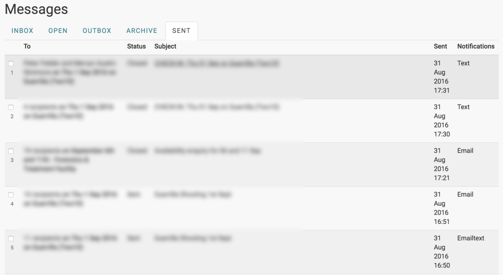
On the messages, a message could be only viewed in your inbox or in the list with people that the user created to send out messages and to book them. Instead we separated those out into Project Messages, which turns out to be all your messages from all the projects. Now instead of going in inside each list to view a message related to a list/project, the user can go directly to project messages and view them all.
User flow for production
- Create new blank message
- Select a preset message (via drop down)
- Message body populated with selected message content
- Can then edit contents in the message body
Wireframes
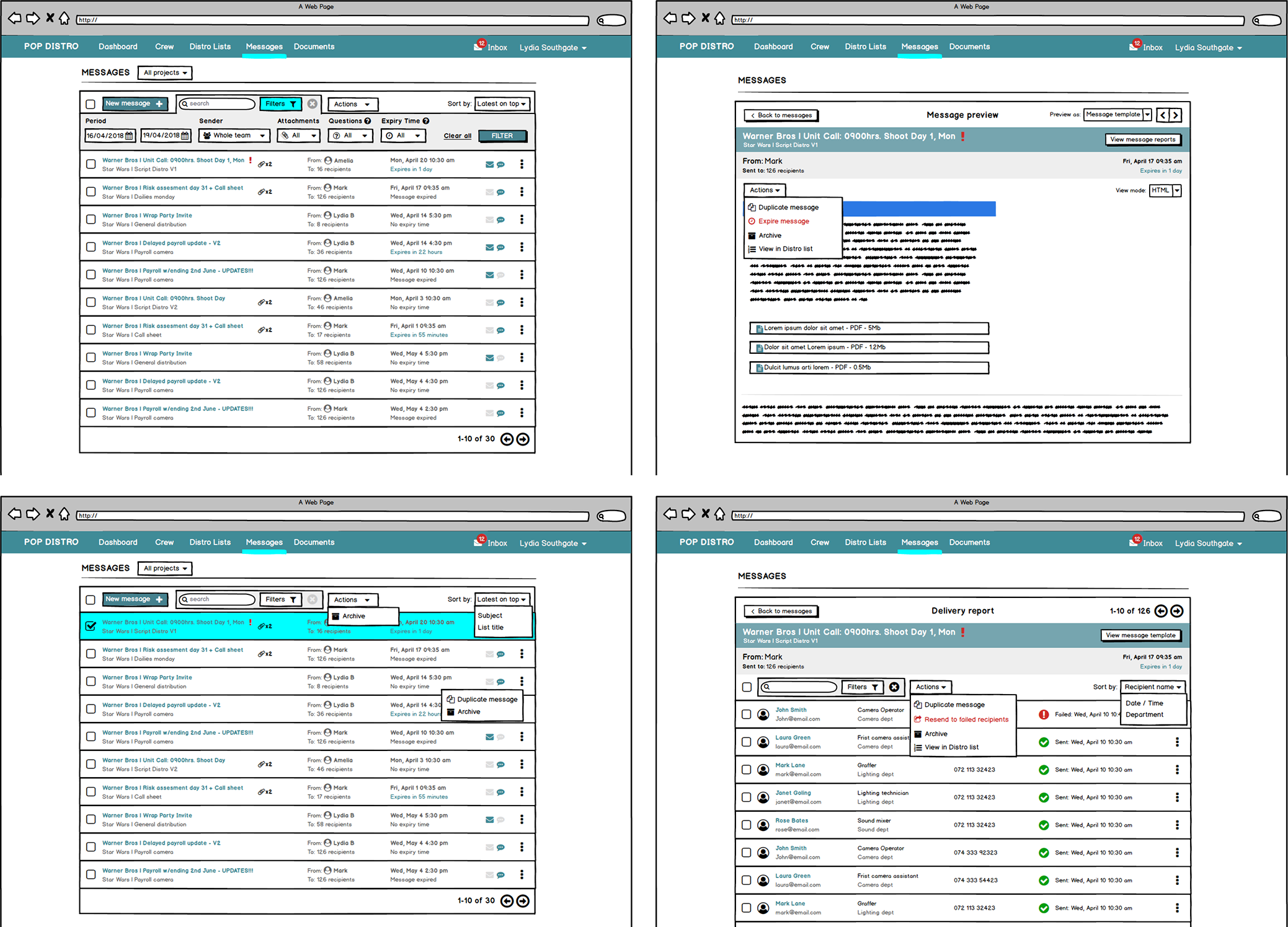
Having the sketches and validating the wireframes internally with the user team. The project messages began to take shape with Balsamiq Mockups.
New Screens
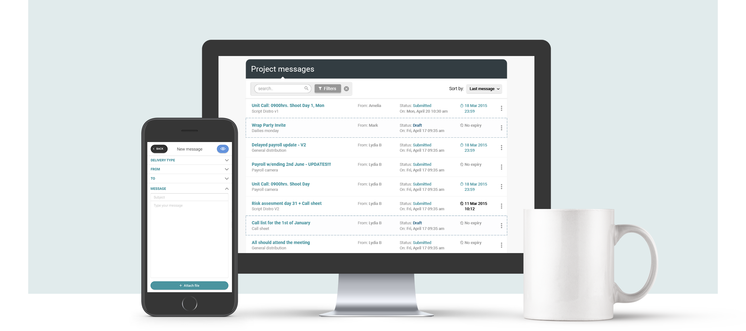
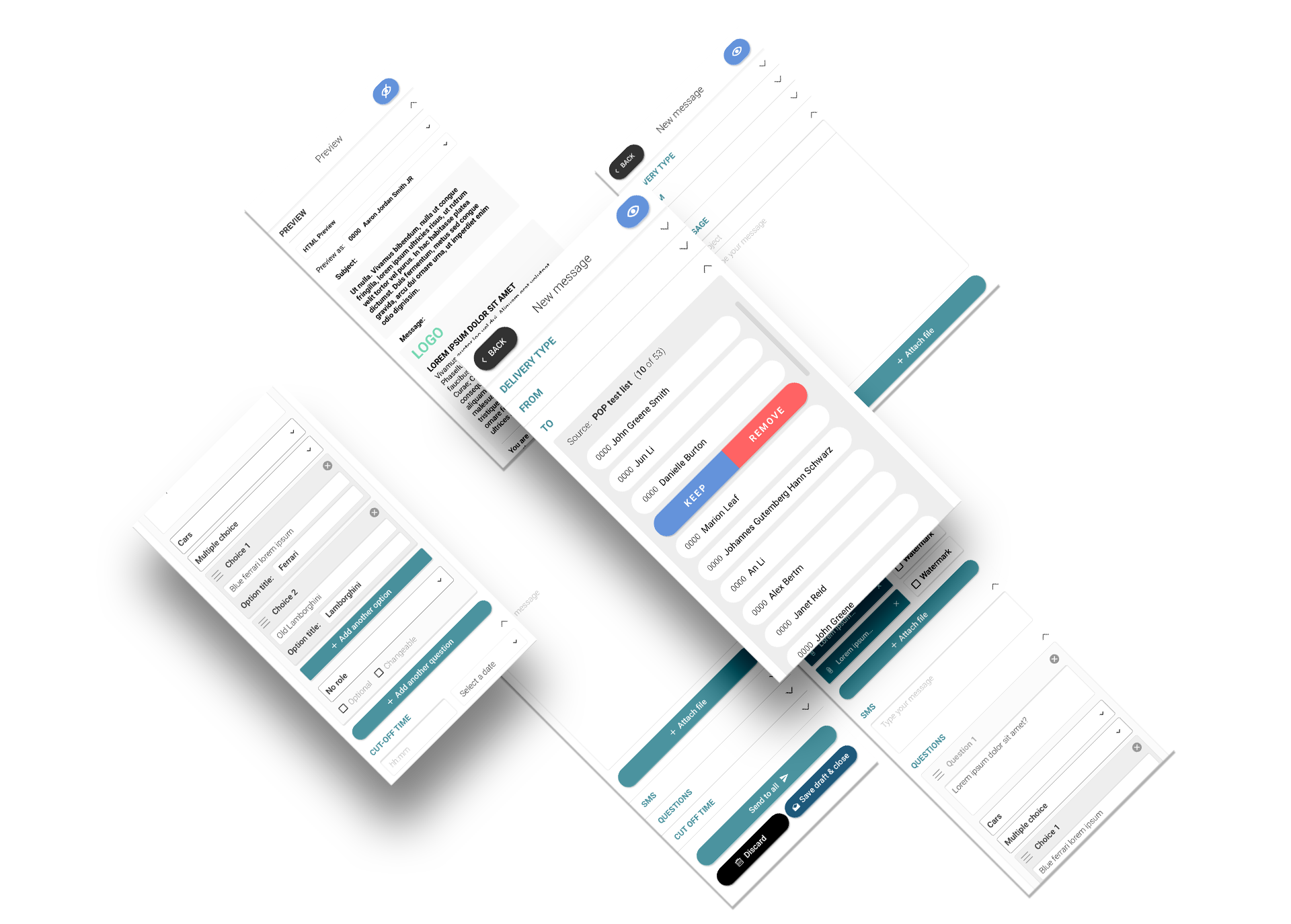
After running some user testing and working out the technical restrictions that we had, we started to mockup the new screens to life. While keeping the same identity and colour schemes of POP I rejuvenated the project messages. The overall design was made to be simple and easy, so it feels natural and comfortable. This was the result:
Thank you
If you’ve made it this far, thanks for reading. I hope this gave you a peek into my design thinking and how I rationalise my decisions, as well as the way I work. Please leave a like or share to show your appreciation.


Leave a Reply
You must be logged in to post a comment.